Color: What a difference a year makes!
In 2013, decorating was all about bright colors (“Tangerine Tango,” for one!) that added boldness and depth to home décor. Both homes and commercial spaces embraced the trend in an effort to shake things up and try something new or to differentiate and brand.
My, what a difference a year makes! This year, the trend is veering back to neutrals, but not without homages to the boldness of 2013. Pops of color (such as Pantone’s color the year, “Radiant Orchid”) and bright accents are still on trend.
The 2014 neutrals are “whispered pastels,” whose lighter pigments act as the perfect backdrops for art and furniture. From lighter blues, greens and grays the soft blushes, the palette is neutral without being the much-dreaded “beige.”
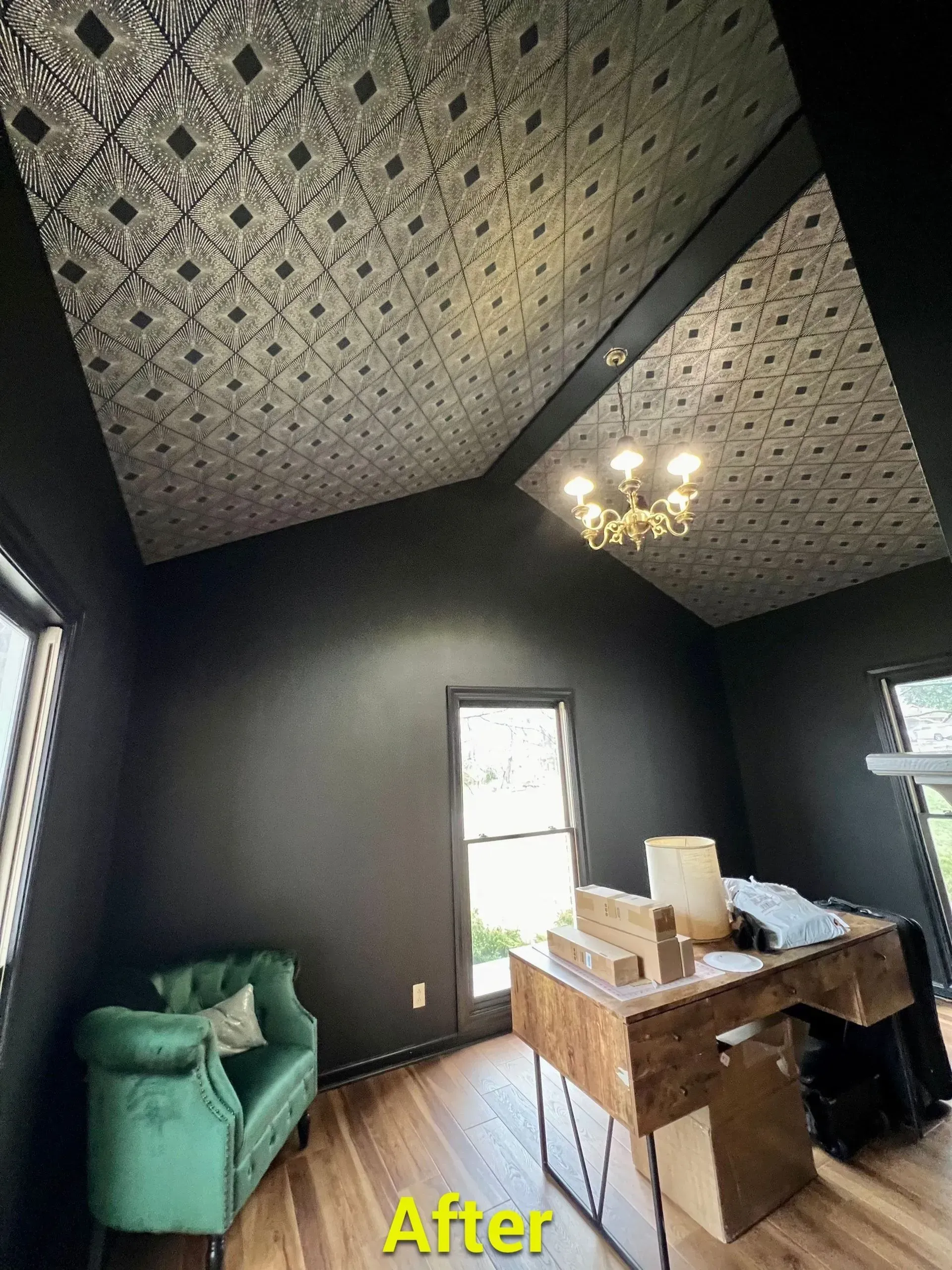
Trying to evoke a modern feeling in a room? Steer towards grays. Seeking peace and tranquility? Seek out the new neutral greens and blues. A sense of creativity and beauty is conveyed by the violets. Of course, the more traditional earth tones continue to create warmth in a space.
If the moving target that is color trends befuddles or overwhelms you, McLain’s Painting Service is happy to provide clients with a complimentary color consultation.
